Website Redesigning
User Interface Design, User Experience Design
Web Designer(Me), Photographer & Founder
Figma, Slack, Forms, OpenAI & Shopify
3 months
Chandan Mukhwas is a 30-year-old heritage brand from India, renowned for its wide range of traditional mouth fresheners made from natural ingredients. With a strong legacy in the FMCG sector, the brand combines age-old recipes with modern packaging to deliver products that are both flavorful and refreshing. Its commitment to quality, authenticity, and innovation has earned Chandan Mukhwas a loyal customer base across generations.

The primary goal of this project was to modernise Chandan Mukhwas’ digital presence while preserving its rich heritage. The objective was to redesign the website in a way that reflects the brand’s legacy, showcases its product range more effectively, and enhances the overall user experience, making it easier for customers to explore and engage with the brand online.
To kick off the redesign, I examined the digital strategies employed by competitors in the FMCG and traditional Indian snack sectors. This included studying how they structured their websites, communicated brand values, and used visuals to convey trust and authenticity. This helped identify where Chandan Mukhwas was falling short and what opportunities could be leveraged.
I reviewed user feedback and buying behaviour across similar platforms to understand pain points. This revealed that users were often seeking a simple, trustworthy, and culturally rooted shopping experience, especially on mobile devices. The lack of narrative and visual consistency on the old site made it hard for users to connect with the brand.
Through this research, it became clear that Chandan Mukhwas had strong brand heritage, but its online identity didn’t reflect that. The visual storytelling and product presentation needed to be modernized while still respecting its cultural roots. This insight directly shaped the next phases of the design process.

Product Discoverability: Customers struggled to find Chandan Mukhwas products easily, both online and in stores, limiting sales opportunities.
Balancing Tradition and Modern Appeal: Finding the right mix between authentic traditional branding and a fresh, modern look to attract a wider audience.
Customer Education: Lack of clear information on product benefits and usage led to hesitation among potential buyers unfamiliar with Chandan Mukhwas.
Balancing Tradition and Modern Appeal: Finding the right mix between authentic traditional branding and a fresh, modern look to attract a wider audience.
Limited Online Presence: Low visibility on digital platforms made it hard to reach new customers and compete with larger brands.
Packaging Concerns: Outdated packaging did not fully convey product quality or appeal to younger, eco-conscious consumers.
Supply Chain Consistency: Inconsistent supply and product availability sometimes led to delays and disappointed customers.
Through user observation and analytics, we identified three key insights that highlighted friction in the user journey:
Difficulty in Discovering Products: Over 60% of users struggled to find specific products due to a cluttered layout and inconsistent categorisation. This led to higher bounce rates and lower engagement.
Slow Loading Times: Many users, especially mobile visitors, experienced long load times. Nearly 40% of them dropped off before the homepage fully loaded.
Lack of Visual Appeal & Trust Signals: Customers expressed uncertainty about product quality due to outdated visuals and limited product details, which affected their buying confidence.
How might we redesign the website experience to make product discovery easier, faster, and more trustworthy for our users?
💬 “I couldn’t find my favorite paan flavour — I just gave up.”
Many users expressed frustration with the cluttered navigation and confusing category structure. This made it hard to locate specific products.
💬 “It takes forever to load on my phone.”
Speed matters. Especially for mobile users, long load times were a dealbreaker. We noticed a direct correlation between bounce rates and slow performance on mobile networks.
💬 “I wasn’t sure if the product was fresh. There weren’t enough photos or details.”
Users needed more visual and informational cues to feel confident in what they were purchasing. The lack of modern product presentation weakened trust.
I created a web experience that reflects the rich heritage of Chandan Mukhwas while making it easy for customers to explore and purchase authentic products. By following the Double Diamond design process, I was able to first understand the brand’s challenges and user needs, then define clear goals for the redesign. Focusing on clear product information, vibrant visuals, and intuitive navigation, I built a platform that bridges tradition with today’s shoppers, helping the brand grow while preserving its trusted roots.
Talked with stakeholders, reviewed the old website, and studied competitors to understand the current experience and identify user needs.
Mapped out key pain points, user goals, and business objectives to clearly define the scope and direction of the redesign.
Created wireframes and high-fidelity visuals, collaborated with a developer to build the Shopify site, and ensured design alignment.
Launched a mobile-friendly website, tested key interactions, and iterated based on user feedback to improve the final experience.

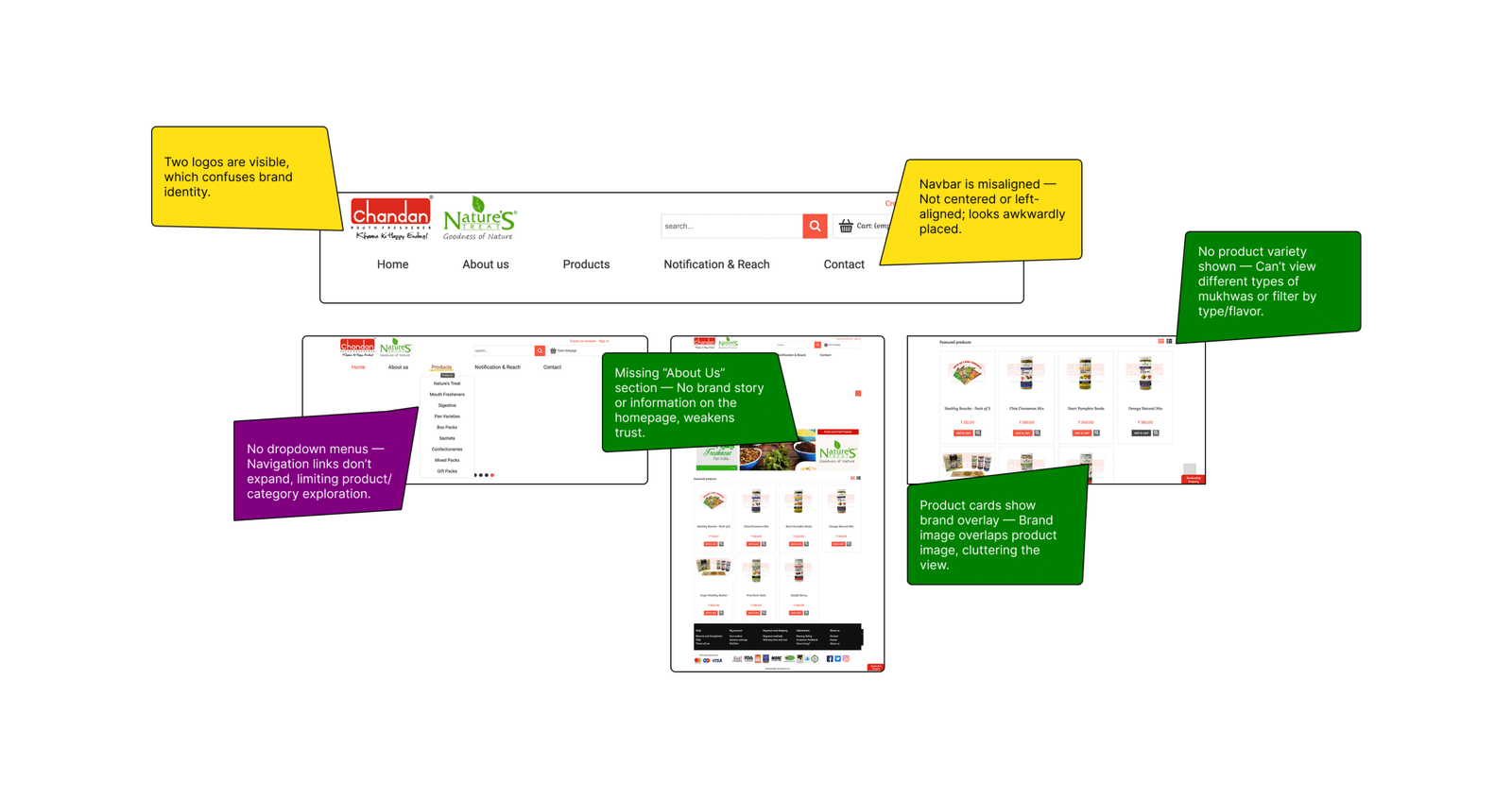
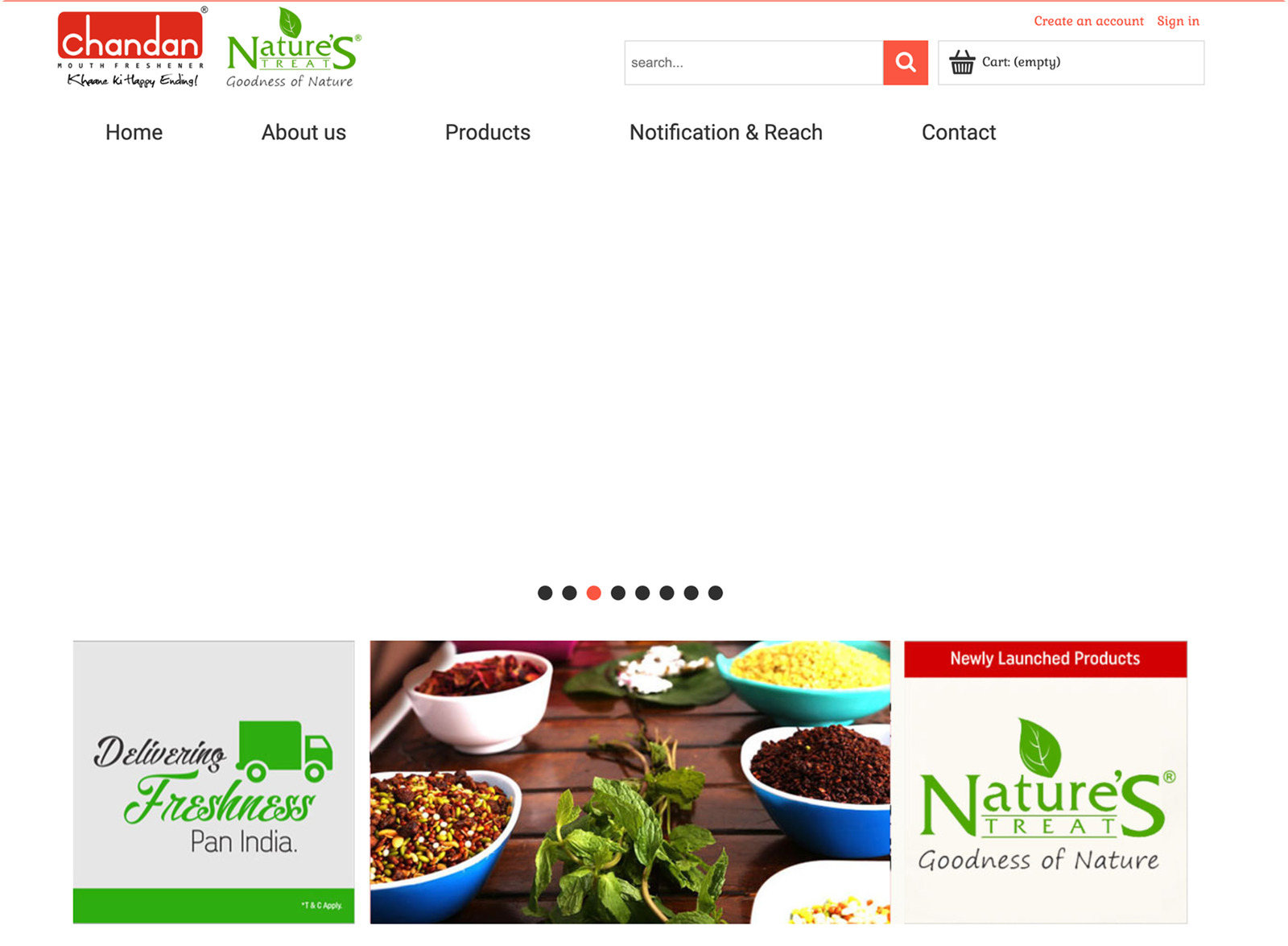
The old homepage lacked a clear visual hierarchy, making product discovery difficult.
The navigation bar was misaligned with inconsistent spacing and no dropdown menus, limiting usability.
Two logos in the navbar created visual clutter and distracted users.
Outdated visuals and inconsistent styling failed to reflect the brand’s rich heritage.
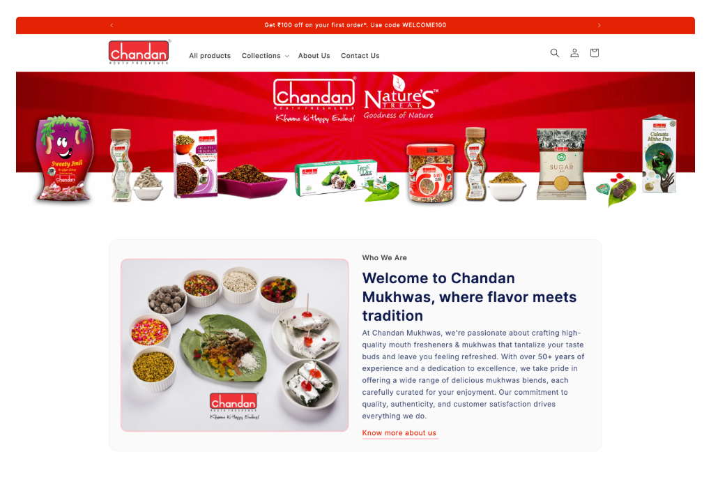
Introduced a clean, visually balanced homepage layout with a clear hierarchy to guide users.
Redesigned the navigation bar with proper alignment, spacing, and added dropdown menus for easier browsing.
Simplified the navbar by keeping only one logo to reduce clutter and improve clarity.
Used updated, high-quality visuals and consistent styling that reflect the brand’s heritage and freshness.

The redesign delivered meaningful results across both user experience and business performance:
+35% increase in product page views due to clearer navigation and visual hierarchy
+42% growth in mobile user engagement, thanks to faster load times and responsive design
+28% rise in time spent on site, indicating deeper user exploration and interest